|
My best artwork this year that I made was from the printmaking unit. I like that one a lot because I like the design I picked, I liked how you have to make it, and I like actually making it, cutting it is very relaxing. I like how layed back and simple this artwork was and just how simple you could of made it, less pressure on myself. 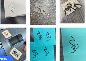 An artwork I would want to redo would be my landscape artwork. I would change the way I did the bottom half of it, make my tree more realistic and probably make the sky blend better. The idea of the tree was to make it colorful with the blue instead of it being so plain, and at first I was going to have some leaves falling onto the groud but the layout is just weird I think. I was at home while making this artwork so maybe if I was at school it could have turned out better. 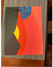 Something I learned a lot during this class this year was to talk and get feedback from other people. On a lot of my artworks I asked Kyla, Destanee and Mrs. Underhill on what they think I should do, what looked weird, what materials I should use, any ideas on what I should do or change with my art. It really helps getting feedback from other people, getting their point of view and seeing it from another angle will help with a lot of things in life. Not being afraid to ask their opinion or asking for help will be used in life many times.
One thing I wish I did was the screenprint onto shirts, I know we had the chance but I did the soft-cut and I wish I had more time to do the screenprint. I really did like soft-cut so I am glad I did it but making a shirt would of been fun as well, plus being online didn't help anything with time so if it was a normal year I think I would of had time to do both.
0 Comments
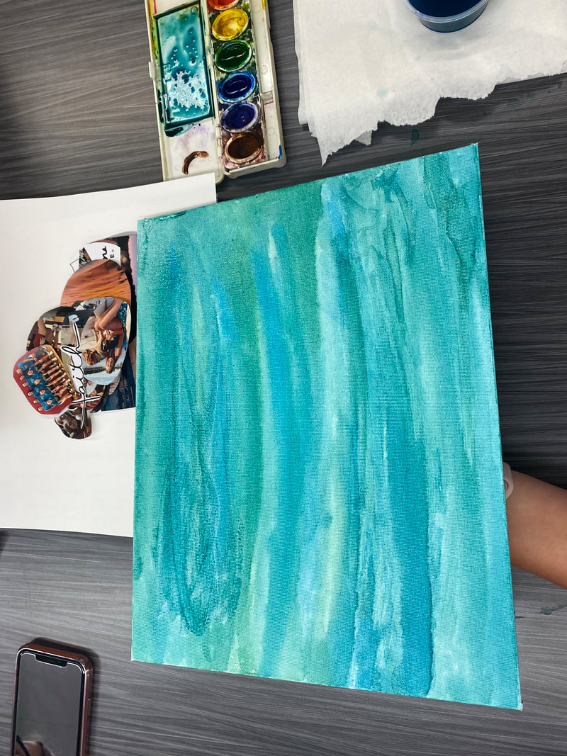
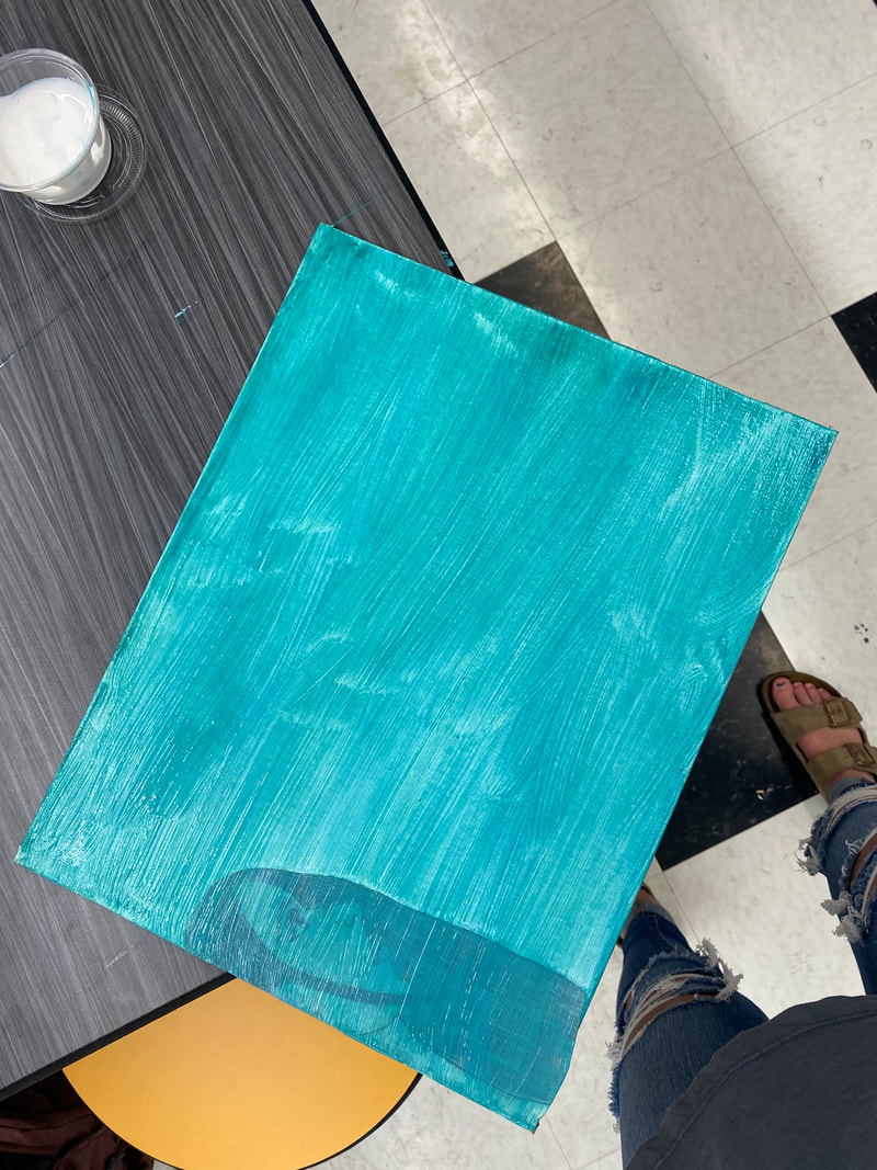
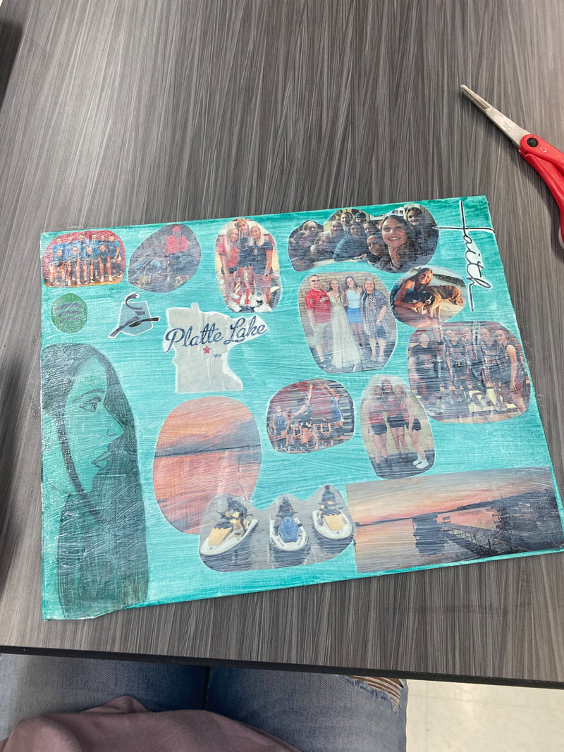
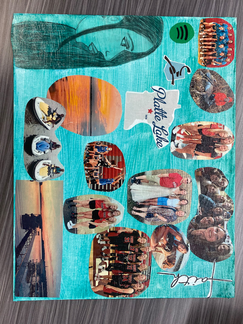
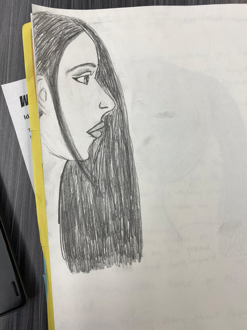
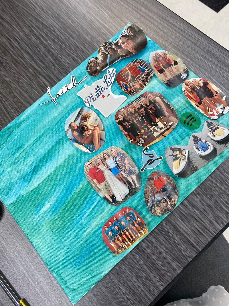
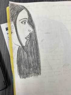
5/26/2021 0 Comments "Artist Statement-Identity"My artwork has a blue and green colors mixed and blended together. There is a side profile of a lady in the bottome left corner that is blended in with the blue and green. I modge podged over the canvas with the side profile and then I layed down images that represents me and what I love to do. There is 16 different images scattered around the canvas and around the lady. They're all different shapes and sizes. Some of the pictures are overlapping in the coners but not all the pictures. I created this artwork by painting the canvas with blue and green water-color paint. Then I modge podged the side profile that I drew in the bottome left corner, which made the water color pick up so it blended into the lady and she became the color of the canvas background. Once that dried I went over with modge podge again and layed down the images I selcted that are apart of my identity and things that I love. Creating this artwork didn't take a lot of steps, but it took me awhile to draw the lady and I never did get it to look like me, but it still turned out good.
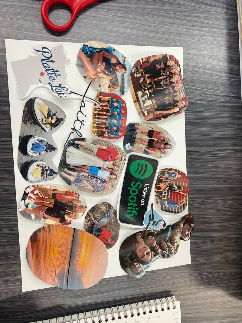
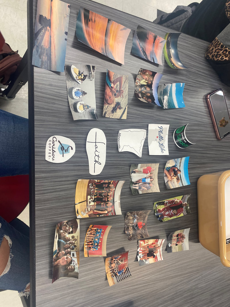
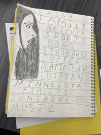
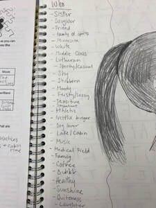
The idea behind artwork was to show and express the things I love and what makes me, me. I chose the background color because those two colors (blue and green) are in my top favorite colors. The lady in the artworks represents me and looking at who I am. The pictures that I chose all have meaning and great importance to me. I have my friends and I for one picture, with them I am outgoing and always laughing, they are so important to me, we all push each-other to be our best and we all can have a fun time but also have serious conversations. I have three basketball pictures. Basketball takes up most of my time and I have been playing since I could walk really. I have a picture of Pierz basketball with BALK (Britney, Alyssa, Lyndsey me, Kenna) and Courtney and Emily. I chose that picture because during the last strech of basketball us six stayed home to distance learn so we wouldn't have to miss the last games in case we got contacted trace and we all got so much closer. The other basketball pictures are from my AAU basketball team I joined called Minnesota Comets, I chose those pictures because its a new experience for me, playing and making new friends. The picture of me hunting is the time I shot my first deer, I am not a big hunter but I go with my dad because I like spending time with him. The volleyball picture is of Maddie, Alana, and I, we got JV and were scared because it was a big jump from JH to JV but we had each other. I put "faith" because I would say I am a religious person and believe in God. Spotifiy and Caribou I just love. Platte lake is where I bascially live in the summer, its my happy place, and since I moved we sold our house where I grew up so our cabin is like the "place I grew up" that we still have now. My family is the most important thing in my live. My parents are always there encourging me and supporting me through everything and without them I would be no-where. My sister is my inspiration. I sometime feel the pressure from coaches and my parents even that I have to be just as smart, and good at sports as her, which is a LOT to live up to but she is there giving me tips and just there to listen and help me with everything. My dogs are like my little siblings since I am the youngest. They're my entertainment and next year without Courtney they're all I will have when my parents get to much. Track picture is Jenna, Maddie, and I its my first year out and without them I wouldn't even consider doing it. They make it so fun and make it seem 100x less scary. On the jetskis is Lexy, Alana, and I. Lexy and I are cabin neighbors and Alana is only four cabins down from us. Without them at the cabin I would be so bored, they make my summer so much fun and we all have the best time together. Sunsets at the cabin are the best, and a great thing to see at the end of the day. Without sports I don't know who I am or what I would even do, I really don't have any other hobbies. My overall thoughts are good, I do actually like how the background color blended onto the lady it looks good like that, I just wish that she looked more like me and I had more pictures so more could overlap instead of just a couple. My goals were to show what I love and who I am, and I think I did a good job of that.
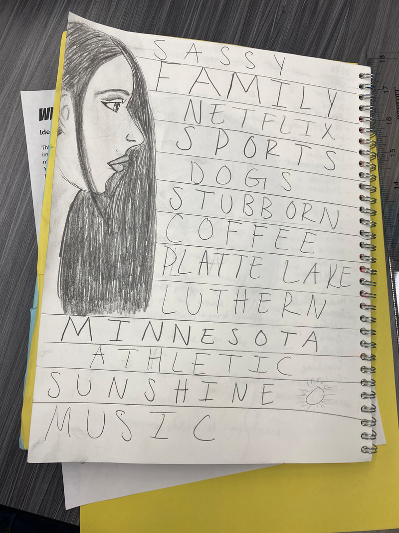
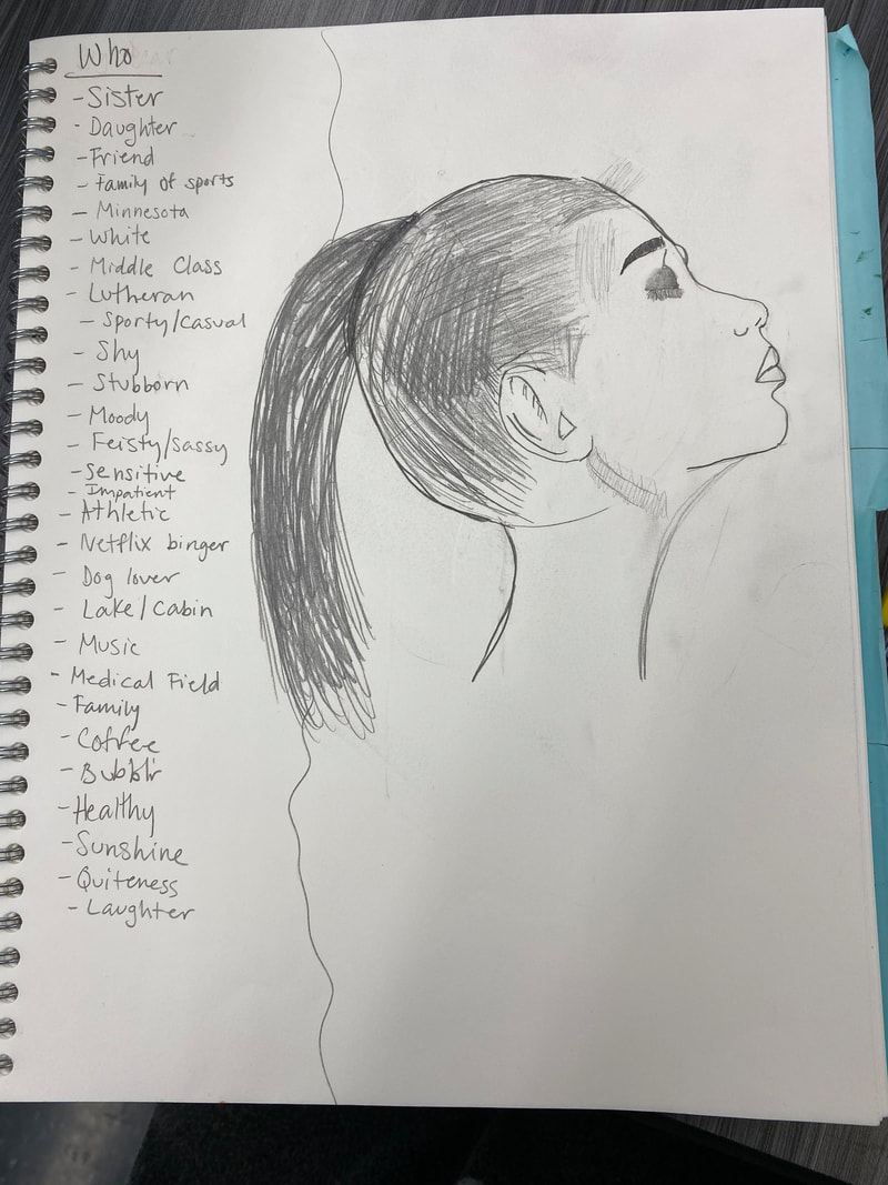
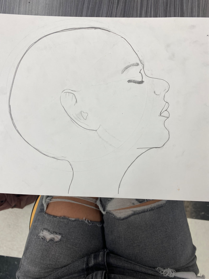
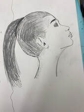
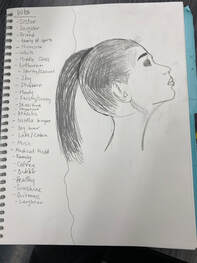
5/18/2021 0 Comments 5/14/21Some studio habits of mind that I am using are express and envision. I use express by trying to show the meaning behind by artwork, showing my ideas about me. Envision I use by doing rough drafts and seeing how it looks and moving foward from there. I painted a canvas one of my favorite colors, then I printed out pictures that are important to me and what I think makes me, me. Then I am drawing a side profile (suppose to be me) and putting it on the side like it is facing all the pictures. The beginning I was going to just write down the things that are important to be, who I am. But instead I am using the pictures. I really like the color of the canvas that I did. Its a good mix and makes the pictures and side profile pop. I am still working on my side profile so it looks more like me then a random person.
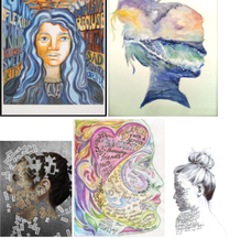
5/7/2021 0 Comments 5/7/21I am using express by having meaning of who I am, what I like, and what makes me.... me. Using this I'm learning to create my art trying to show all of that. I am also using reflect, everything that I wrote down about me, my life, what I like will reflect off onto my artwork. Talking and expressing my ideas with Mrs. Underhill and some of my classmates getting their ideas seeing what would work best and look the best. My idea is to do a side profile of a women (maybe she'll look like me a little bit) and for the background have pictures, and symbols of things I love, and things that describe me. I found artworks that I like, in the first picture in the left top corner I like the background, the right top corner I like the way she did her hair, still not decided on how I want the hair. The bottom left I liked the idea with the scattered parts, but I don't think I will do that. Bottom middle is what I was orginally going to do, have the words inside of the profile, but the way I draw the face is too small I think for that. Some with the right bottom so small I think. So thats why I think I'm going to collage the background.
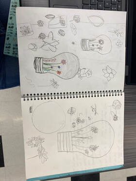
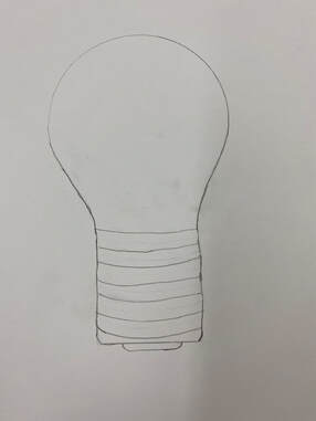
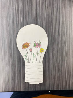
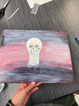
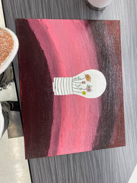
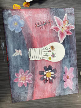
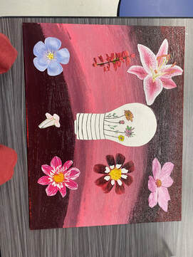
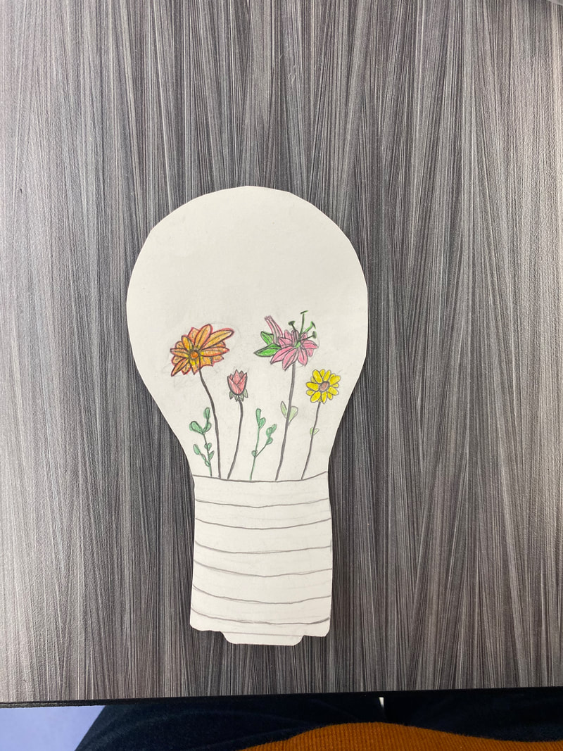
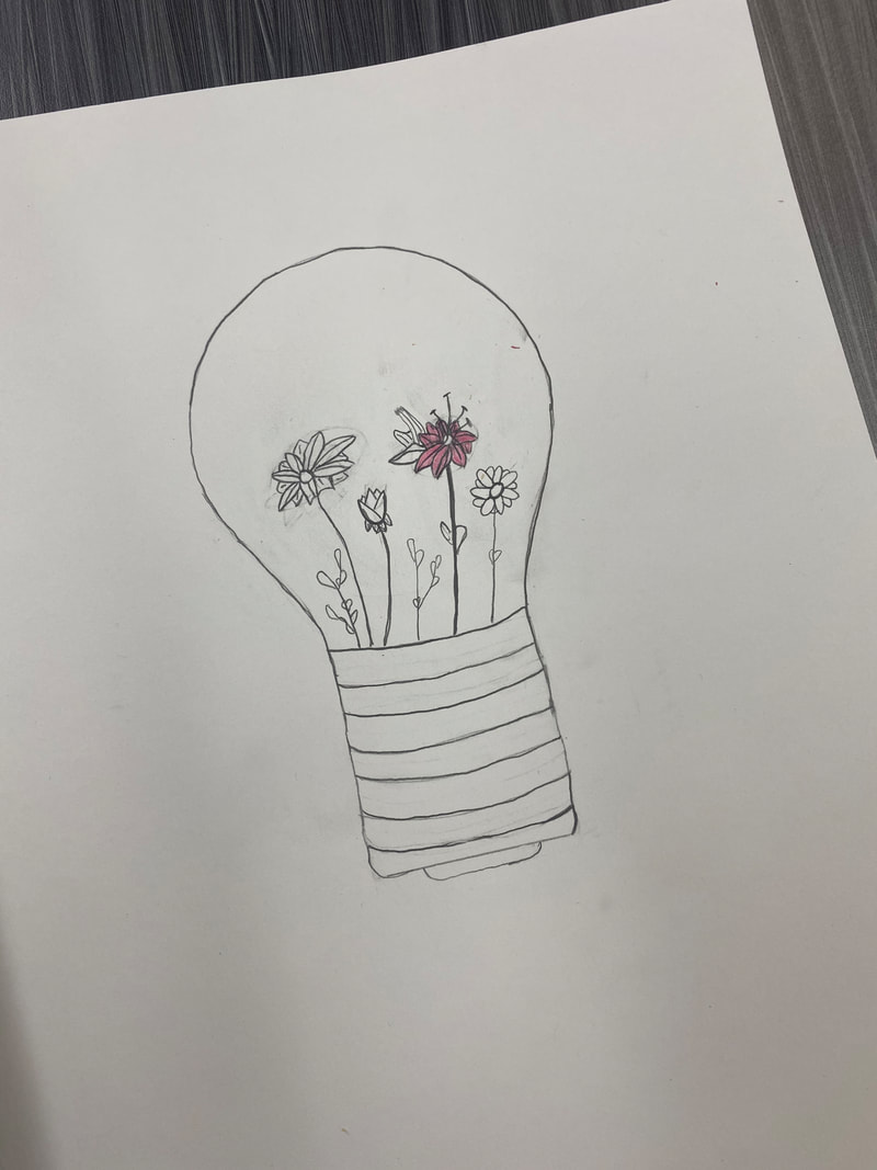
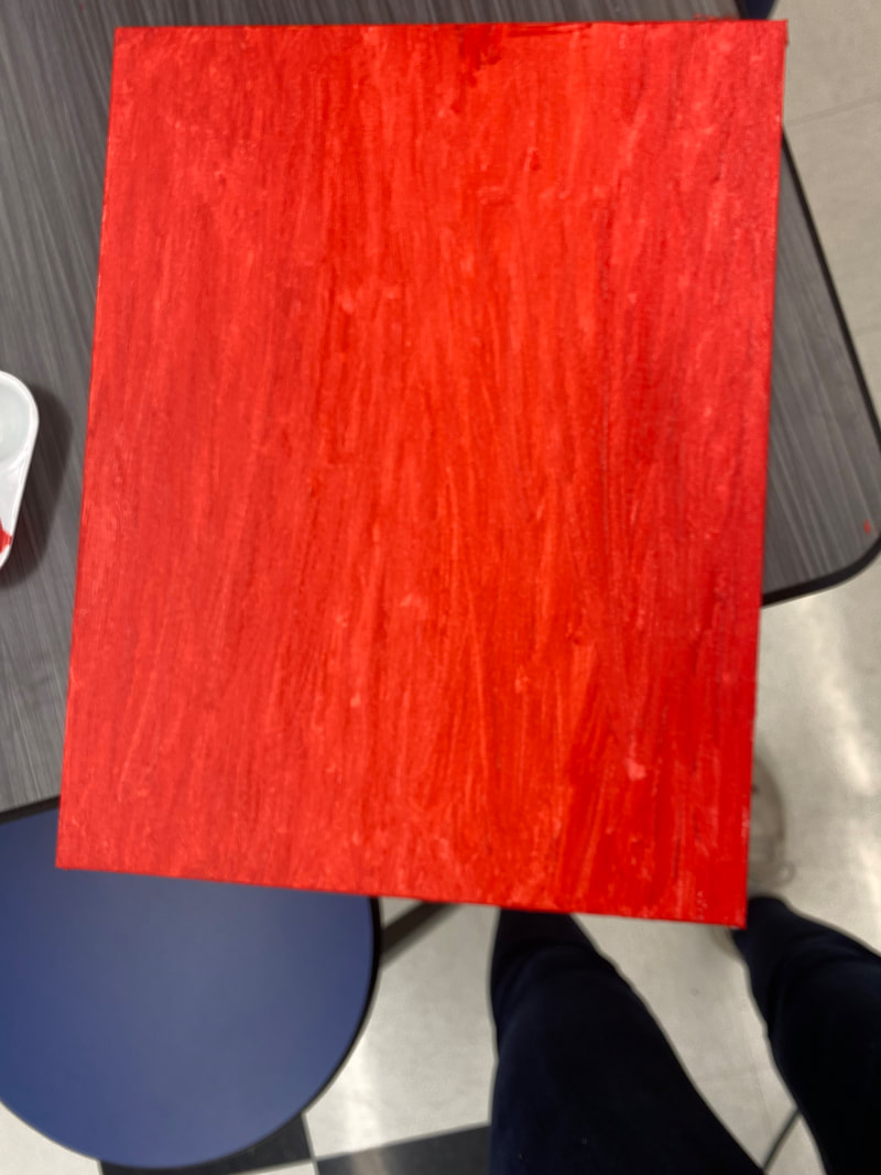
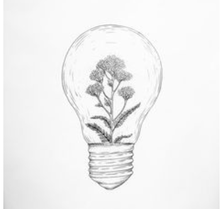
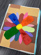
My artwork background is 3/4 different colors. The very top is a dark wine red, then has a very little layer under it thats a purple/red color. Underneath that one is a very dark purple with some red undertone, then under that color is a light bright purple. The layer after that is a purple/pink mixture and under that is a lighter pink. The pink is most of ther center with light purple on top of it for the bottom and top half of the pink. Under that is the final color which is the same as the top red and purple mixed together so its very dark red. For my main piece of art I drew a light-bulb and inside of it I drew flowers. I have 6 different flowers in the light bulb. The first "flower" is all green and its more of like a weed looking thing then a flower. Next to that one is a flower, the petals are yellow with some orange lightly over the top, and the petals are outlined in red. The center of flower is orange with light red on top. Then the next one is a rose, light pink and red shaded together with green leave things on the botton of the rose connecting to the stem. By the rose is another one of those weed things, next to that is a lily flower. The color of the petals are pink, and the liliy filament (thing that is inside if the petals) are a light almost lime green color. On the stem of the lily there is two light green leaves. Then finally next to the lily is a sunflower. The petals are a bright yellow, and the middle is a very light brown. The stem also has two leaves. Then I cut out the light bulb and mod podged it onto the canvas that I described before. Once the light bulb dried onto the canvas I found and cut out pictures of actual flowers. In the top left coner is another pink and green lily, below that is like my weed thingy but instead of it being green like mine it is red. Below that in the bottom left coner is a light blue, purple flower with the center being light yellow and white. then in the middle bottom are three tiny light pink roses. Then in the bottom right corner is a pink/red petal color and a dark mustered yellow. Above the in the right side between the bottom red and top right is a maroon red with white on the bottom of the petals. The center is another mustered yellow but lighter then the flower below it. Now in the top right corner is a light purple with a red middle but there is very tiny red things on the yellow part. I mod podged it on again then once it dried I was finished. The meaning behind mine is just the meaning of spring, a new beginning, to keep on going even when things are hard because there is good in the world you just need to wait and find it. I hope people get good, happy vibes from this artwork. I used recontextulization and justaposition by giving the light bulb new meaning, putting flowers there instead of having it give off light, and by taking the flowers and light bulb putting them together which normally never go together. My thought on my artwork is ehhh, it isn't exactly how I pictured it but it isn't terrible. I wish that the colors in my background blended together better and maybe even choosing different color scheme to use instead. Maybe making my light bulb bigger and the flowers inside as well.
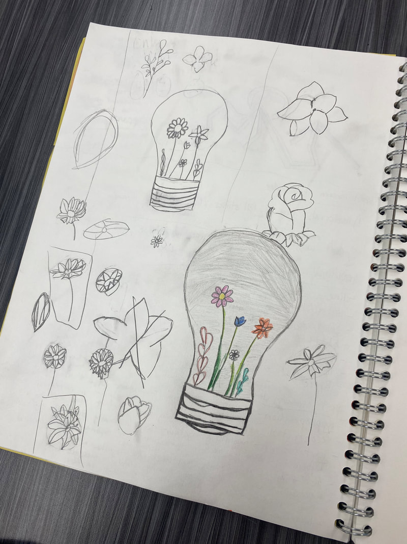
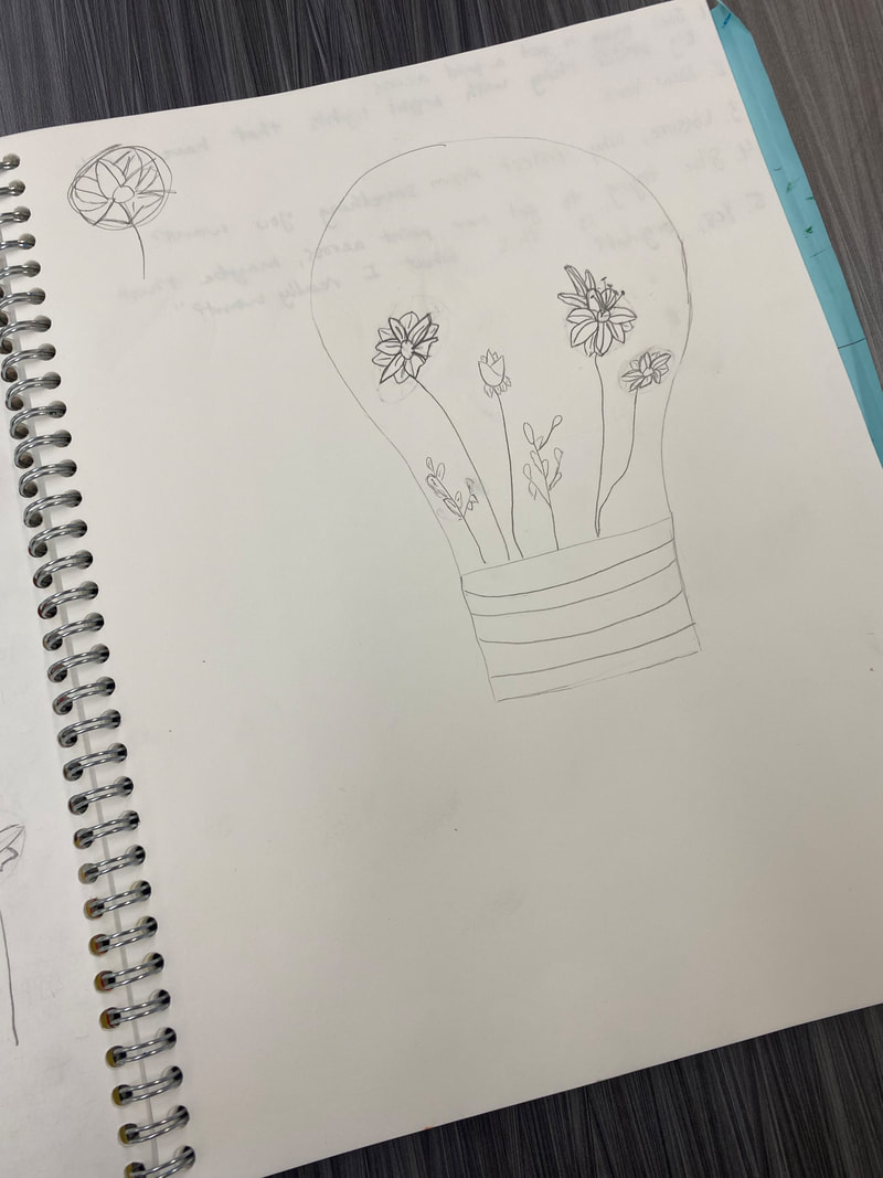
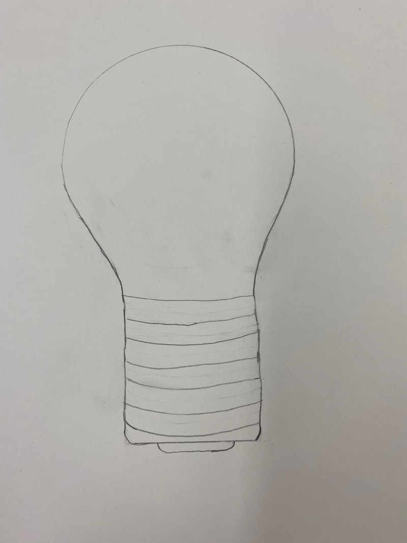
4/26/2021 0 Comments 4/26/21I am using juxtaposition and recontextulization. Juxtaposition is when you put two things together that normally don't go together. Recontextulization is when you take something and give it new meaning. I used juxtapostion because you don't see flowers in a light bulb, and recontextulization by giving the light bulb a new meaning, it's not giving off light like normal. At first I was planning on using text and image and I just couldn't figure out what I wanted to do. Ideas for a pervious artworks were still in my sketch-book and I saw the design for the artwork I am drawing now. My plan is painting a plain background and then laying down the cut-out of the light bulb with flowers in it. I drew the flowers inside of the light bulb and colored only the flowers. Two studio habits of mind I used were "understand art worlds" and "express". I used understand art worlds by looking at different artist and how they used the postmodern principles so I would get ideas on what to do for my artwork. I used express by learning the postmodern principles and figuring out how to use them and which one I want to work with. I had to get different ideas.
4/14/2021 0 Comments 4/14/21 postmodern principles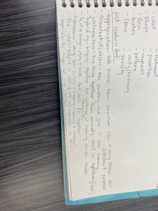 I am planning on working with Text and Image and also Juxtapostion. I choose these because I found some ideas that I like and they could work separtely or together. Text and Image can have a lot of meaning behind it and bring awarness or make people think about it and realize that it happens to people they don't think it would happen to or to more people then what they think. Juxtapostion would be good because you're bringing things together that isn't normally together so people stop and think about that why and get to a deeper meaning.
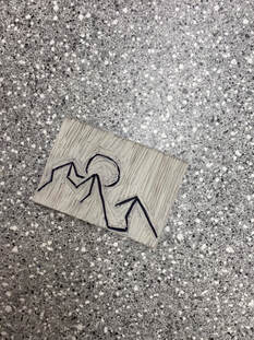
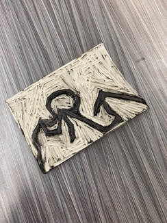
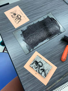
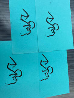
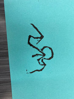
4/12/2021 0 Comments 4/12/21 PrintmakingTwo studio habits of mind that I used were stretch and explore and then develop craft. Stretch and explore I used by if I messed up carving I just work with it because you can't go back and fix it or just do something over it. In this way you work with the mistake and take it and keep going. Then now while you keep carving you know what NOT to do. I used develop craft by learning the tools and materials I am working with, since this was my first time using these tools and materials. This artform is different then most, we aren't drawing or painting like most people think of when they think of art so I like this just because it's different and fun to do. 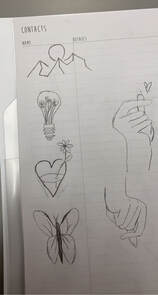
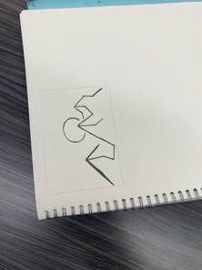
I choose to do the soft-cut because I never done it before and it seemed like a fun thing to do with different designs. I drew out a lot of different designs and chose the mountains and sun. You trace it onto the block and carve the grey empty space out. Then trial and error to see if there is any carving places you missed, once you get it to a spot you like then make the print four different times to make a series. The struggle I has was getting all the extra grey off so it wouldn't be on the final print, and getting all the fine lines. I like how it turned out and the design I chose, no one really had the same as mine which I like.
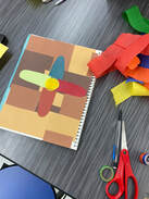
3/31/2021 0 Comments collageI created a flower with a layerd shades of brown for the background. Some struggles that I encountered with making this were the blue, orange, red, and green stremer things, you can see the glue through them and it just doesn't look the way I pictured it would. I wish I made all the flower petals pointy on the tops instead of some round, some pointy, and some like squarish. I do like the way the flower petals are different materials and colors I think it really stands out and people know it's a collage. I also like the background, the different shades of colors but instead of different materials the different shapes I cut out. I learned that they don't always have to look like colleges, they can be and still look like paintings or drawings too. Also that they can have the drawing or whatever the artwork is take it apart add something in there or change things around and then put it back together.
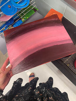
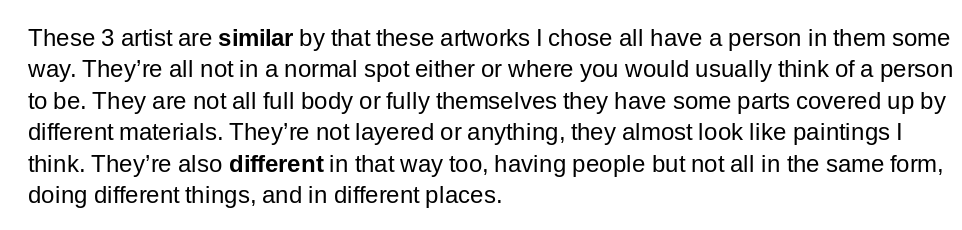 3/17/2021 0 Comments artist statement "landscape"This artwork is of a green hill going downwards and a charcoal grey moutain behind the hill. You can see the bright yellow sun peaking up between the hill and moutain. Above the sun is different shades of red/pink for the background sunrise. The first layer after the sun is and orangey red and above that is a darker peach color. The third layer is a light peach color and above that one is a light pink, that is the last layer. On the highest part of the hill is a dark brown tree. On the braches of trees are different shades of blue and white leaves. I created my artwork with arclic paint. I sketched my ideas out and practiced in my sketchbook until I got it the way I like it best for the canvas. I blended blue and yellow to get my green color. Then I added a little of white to the yellow for my sun. For the moutain I also added a tint of white to the black for it to be not solid black. For the tree I just left the brown because I needed it to be dark enough to see on the green. For the sunrise shades I just blended a lot of reds and whites and oranges to get the colors I have. For the leaves I tinted blues with whites and dunked them in q-tips and dabbed them onto the paper. I wouldn't necessarily say that there is a big meaning behind my arkwork expect that when I found this image I thought it looked cool and would be something fun to try and recreate. But this does remind me of the sunrises I see at my cabin and I'm always happy and relexed at my cabin so this artwork is meaningful in that way. It shows landscape well I think in this and its not stright across which I also like. My goals for this artwork were to really like my finished artwork and learn what colors mix well and how they all turn out together. I also wanted to finish this on time and not slack especially since I am at home. A couple things I would change or fix would be the first layer after the sun make that red/orange color lighter so it would blend better with the rest. I would also make the dots lighter for the tree so you would see the branches better. 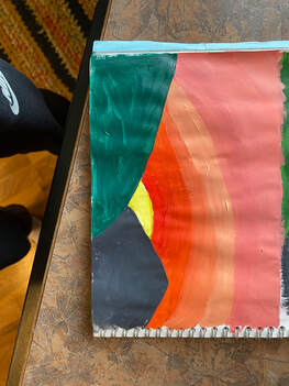 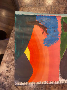  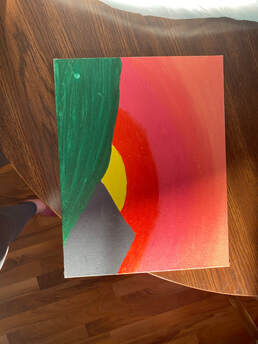 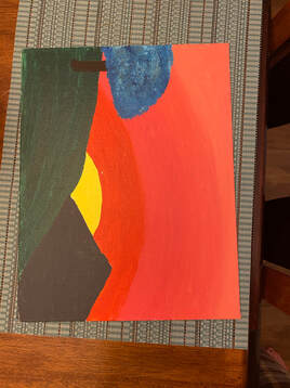 |
AuthorMy name is Lyndsey Strohmeier I am a 9th grader. I love watching and playing sports. My favorite color is gray sage. Archives
June 2021
Categories |


 RSS Feed
