|
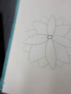
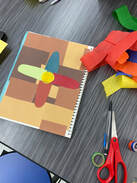
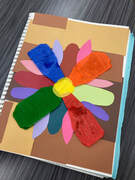
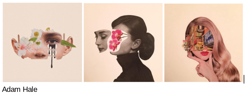
3/31/2021 0 Comments collageI created a flower with a layerd shades of brown for the background. Some struggles that I encountered with making this were the blue, orange, red, and green stremer things, you can see the glue through them and it just doesn't look the way I pictured it would. I wish I made all the flower petals pointy on the tops instead of some round, some pointy, and some like squarish. I do like the way the flower petals are different materials and colors I think it really stands out and people know it's a collage. I also like the background, the different shades of colors but instead of different materials the different shapes I cut out. I learned that they don't always have to look like colleges, they can be and still look like paintings or drawings too. Also that they can have the drawing or whatever the artwork is take it apart add something in there or change things around and then put it back together.
0 Comments
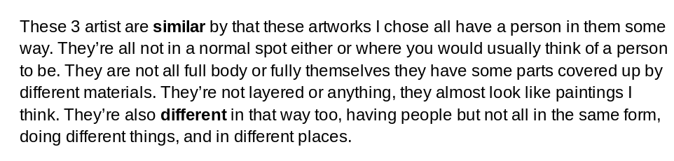
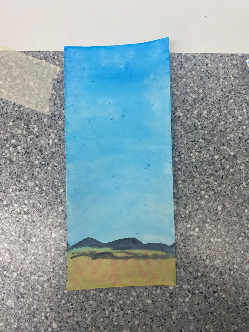
3/17/2021 0 Comments artist statement "landscape"This artwork is of a green hill going downwards and a charcoal grey moutain behind the hill. You can see the bright yellow sun peaking up between the hill and moutain. Above the sun is different shades of red/pink for the background sunrise. The first layer after the sun is and orangey red and above that is a darker peach color. The third layer is a light peach color and above that one is a light pink, that is the last layer. On the highest part of the hill is a dark brown tree. On the braches of trees are different shades of blue and white leaves. I created my artwork with arclic paint. I sketched my ideas out and practiced in my sketchbook until I got it the way I like it best for the canvas. I blended blue and yellow to get my green color. Then I added a little of white to the yellow for my sun. For the moutain I also added a tint of white to the black for it to be not solid black. For the tree I just left the brown because I needed it to be dark enough to see on the green. For the sunrise shades I just blended a lot of reds and whites and oranges to get the colors I have. For the leaves I tinted blues with whites and dunked them in q-tips and dabbed them onto the paper. I wouldn't necessarily say that there is a big meaning behind my arkwork expect that when I found this image I thought it looked cool and would be something fun to try and recreate. But this does remind me of the sunrises I see at my cabin and I'm always happy and relexed at my cabin so this artwork is meaningful in that way. It shows landscape well I think in this and its not stright across which I also like. My goals for this artwork were to really like my finished artwork and learn what colors mix well and how they all turn out together. I also wanted to finish this on time and not slack especially since I am at home. A couple things I would change or fix would be the first layer after the sun make that red/orange color lighter so it would blend better with the rest. I would also make the dots lighter for the tree so you would see the branches better. 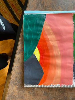 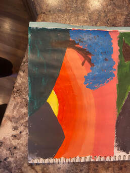  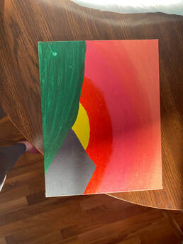 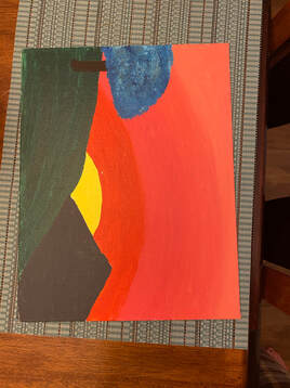 3/12/2021 0 Comments 3/12/21Two studio habits I am using is develop craft and express. I use develop of craft by using different tools to get the art form I want. I use expression by trying to get the art to look like the idea in my head and the inspiration pictures I have. Also trying to get the way I feel about the painting across. In the top picture I will try to get the background color the same, I like the shades of blue they used it makes it seem different because you don't really see those colors as a sunsetish background. The bottom picture I will try to get the tree the game, the leaves on there are really pretty and will make the blue background pop. 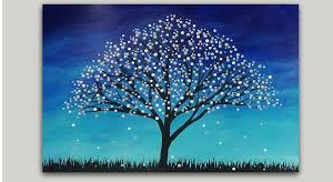 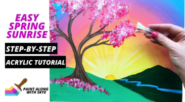 3/9/2021 0 Comments 3/8/21Two studio habits of minds I used while doing painting boot camp were envision and engage and persist. I used envision by the color wheel thinking what I have to do next and what colors I am mixing to make a certain color. Engage and persist I used by fousing on my artworks to make sure I get the colors I wanted and by staying on task to finish with time left. If a color turned out a way a don't like then I would embrace it and fix it or just go from there. I learned that you just have to keep mixing until you like the color you get. 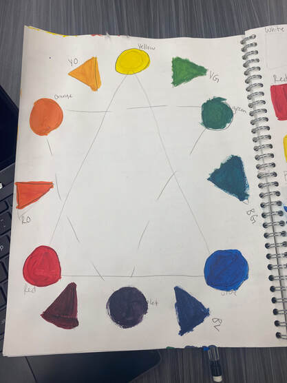 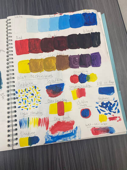 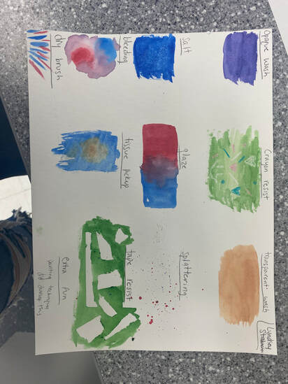
|
AuthorMy name is Lyndsey Strohmeier I am a 9th grader. I love watching and playing sports. My favorite color is gray sage. Archives
June 2021
Categories |
 RSS Feed
